Building
Kaus is a large insurance company that has insurance for any type of situation, sold in complete packages instead of a la carte options. They want an ecommerce site where they can sell insurance online, directly to customers, as well as a fresh, new logo.
Considerations
-
Responsive site (PC, mobile, tablet)
-
Display all kinds of insurance
-
Property, motor, liability, marine, aviation, life, health, and protection
-
-
Efficient filters/navigation
-
Product types and categories are easily identifiable
-
Plans for a business-only section and a login/account page
-
Trustworthy, modern, clear
Research
First, competitor research was conducted. References were extended to both established, prolific insurance sites (ie. Allstate, State Farm, Progressive, USAA) and more modern insurance sites (ie. Lemonade).
Comparisons were made between content, design choices, and site flow. To get a better understanding of the industry, site histories, reputation, and beliefs were also analyzed. Mini-profiles were created based on the information gathered from this research.

Research: Persona
A persona was created to construct a more empathetic vision of the product's purpose and functions. With this, it was not only easier to envision the product, but also better understood who and where to find potential research participants.

Research: Interviews
User interviews found that participants valued:
-
Easy navigation
-
Upfront information
-
Accessibility
-
Representation for unique policy holders
-
Clear options for ways of contact/communication
-
First-impression trustworthiness
-
Making insurance seem low-stress and low-effort while balancing reliability
Research: Surveys


Surveys found that participants valued:
-
Convenience
-
Control of their experience
-
The ability to have a conversation
-
A human presence to rely on if in need
-
Anything that made the experience easy and painless, no unnecessary hurdles
-
A sense of security, or trustworthiness
-
Being able to understand what they’re doing
Synthesis
Based on research findings, the following themes were created to enhance goals:
Human Presence
Users feel like they are supported through every step of the process. Even if they are not talking to a human, the flow and design of the site makes them still feel as if their needs are being considered above all else.
Universal Clarity and Accessibility
Information is upfront and clear; design, flow, and copywriting are set in a way that those who know nothing about insurance can easily understand what they are doing. The less intimidating insurance is, the more they feel like they can buy it on their own.
Painlessness
The website makes an effort to make buying insurance feel easy and stress-free. This includes the stress of uncertainty. Information is easy to find (and read), steps are explained, and the flow is smooth and intuitive.
Building the Website
Potential content was ideated and then sorted in two ways: back to the research table via card sort testing, and visually with design drafts. This helped out figure out how users viewed content about insurance information and the best potential way to present and file it.


Features, pages, and other potential user tasks were then organized by importance in a feature roadmap, to set priorities. These priorities were based on ease of execution and user/competitor research.
All of this in mind, a site map was created to give a visual overview of the site's navigation.

Task and User Flow
To understand the user's viewpoint, a task flow and user flow were created to visualize the steps a user would take to complete basic tasks.
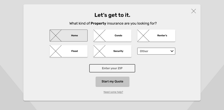
While presented as pages in their current state, the lengthiness of these tasks were considered while building and prototyping, and shortcuts were created with modals, seamless forms, and simply combining content to cut down on the amount of pages users would have to load.


Product Requirements
Next, task and user flows were expanded upon to organize what features would be required for each page of the flow. This included both technical features, such as quote retrieval and help centers, as well as flow and navigation features such as page goals and design considerations.


The main flow focused on the simple act of finding insurance for the user and encouraging them to sign up for an account.
This would be the first step in buying a policy, so the flow had to be simple, painless, and intuitive. This process also targets users who are on the fence about their insurance, giving them a simple task they can interact with without having to come back later.

Based on user research, buying a policy had to be informative, but not intimidating. Users had to both feel like they were in control but also feel like the site was doing everything it could to make the process as easy as possible.
After buying, their choice is celebrated and they are transferred to their account so they can feel a sense of ownership after the purchase.
The account pages continue to make the user feel in control of their policy; they are informative yet understandable with options to view history, file claims, see upcoming payments, ect.
Users are also given many helpful modals/interactive help buttons that will give them a breakdown of anything on their account or policy that they may not understand. A number of customer service are also made visibly available.
Designing the Website
Wireframes were built with functions mapped out in accordance to what content was most relevant to the user and what would make the potential task flows easiest. Information was cut to bite-sized pieces and spaced out generously as to make it more digestible for users who know little about insurance.
Logo, UI, and Feel
Before making a logo, the general aesthetics of Kaus had to be built. With the help of Pinterest, a diverse range of colors, typography, and other various design inspiration was collected to ideate a style that would be suitable for an insurance-shopping experience, yet give Kaus a unique brand identity.


Kaus wanted a fresh logo to accompany their new website, which reflected the following traits:
-
Trustworthy
-
Modern
-
Clear
A logo that was solid, round and easy to read, and had a colorful, modern flair was created.

For the style tile, bright colors, round shapes, and soft but neat font were combined to give a look that was welcoming but professional, as to both appease cautious, mature customers and intimidated, curious younger customers.
It is also a step away from sharper, more industrial aesthetics that older insurance companies tend to take, which make them feel dated.
Finally, a UI kit was built to put the style in perspective and visualize user interactions. This further defined the visual aspects of the site by assigning colors, fonts, and other design choices to specific features of the site, as well as organizing the site's aesthetic so that it felt balanced and unified.

Hi-fi Wireframes
Combining the moodboard, logo, style tile, and UI kit, the initial hi-fi wireframes were built.

Prototyping and Testing
Lo-fi wireframes were cleaned up and made interactive for the purpose of usability testing.
Extra pages were created as needed to give the participant as full of an experience as possible.
Usability Test Findings
.png)
Four separate tests were conducted with two men, 20-50 years of age, and two women, 20-50 years of age. They interacted with prototype under supervision and were told to speak aloud and ask questions with only light guidance of the proctor.
Following these tests, an affinity map map of all responses were organized into positives, confusions/errors, and suggestions, sorted by page or type. This gave an understanding of what should be enhanced and corrected during revisions.
A summary of the findings is as follows:
Positives
-
Visuals and flow were very well-received
-
First-impressions generated interest
-
Formatting and organization were complimented for being easily digestible
-
Conversational tone of writing made participants comfortable
Errors/Confusions
-
Issues with navigation and finding certain pages/content
-
Some concerns with users who did not know how to seek help for some situations
-
Concerns over over-familiarity with copywriting
Suggestions
-
Several suggestions made toward how forms were handled (ie. navigation, progress bar, flow, information)
-
Suggestions to how images and content relevance were handled
-
A participant was concerned over accessibility options (ie. making text bigger for those with poor eyesight)
Final Product
Armed with the usability test findings, the prototype was heavily edited with the most important (or easiest) changes, resulting in the following website:

Some of the changes focused on were:
-
Adding a "Review" page to the forms so that users don't have to click through the whole form to confirm their information
-
Adjusting and modifying some elements so that they fit better on the pages and make content easier to find.
-
Changing some stockphotos to more relevant ones
-
Making the progress bar clickable forwards instead of just backwards, so that users can more easily review the form
-
Making the product pages available on the Find a Quote modal so that the flow is more intuitive.
Other examples of executed revisions:


Takeaways
This project taught me a lot, from research, to information architecture, to design, to prototyping and execution. Beyond all of the technical aspects, however, I also have a lot to think about moving forward to future projects. Here are my top takeaways:
-
Always seek reactions that will combat current assumptions
-
Scatter a wide net during competitor research
-
Less is more, especially in writing, visual design, and task flow; the less effort it takes for a user to achieve their goal, the better
-
Prioritize: it’s okay to take shortcuts for things that are less important as the moment for the sake of efficiency for the overall project
-
Navigation will never not be important, there (may be) nothing worse than a user getting lost or losing interest because the site is too difficult to explore
-
Save your previous work, if for presentation purposes at least
-
Note down everything a research participant has to say, no matter how abstract
And with that all said and done, you are...
All done!
Thank you for your time.


